Powerful forms for data collection and Wide API to merge automation using the best wokflows such as N8N, Zapier. Excellent tool for data collection. Recommended 100%. Furthermore, support is awesome.

Last updated on October 10, 2023 by Formidable Team
How To Analyze Survey Results Right in WordPress
Unlock the potential of your WordPress survey data! Master how to analyze survey results with this 3-step guide. Forget formulas and embrace simplicity with Formidable Forms' pre-built reports.

Approximate read time: 6.5 minutes
Surveys can be a powerful tool for any website. With just a few good survey questions, you can learn a lot about your audience and get important customer experience feedback.
But if you don't analyze survey results as a whole, you're likely to miss out on important insights.
Luckily, there’s a simple — and automatic — way to transform responses into easy-to-interpret survey reports that can help you make better business decisions.
In this article, we'll quickly discuss the importance of survey analysis, set you up for statistical success, and finally take you through a step-by-step guide to getting the most out of your survey data.
Upgrade your WordPress site with powerful, flexible forms.
Why analyze survey results?
You probably already know that online surveys and questionnaires can tell you a lot about who visits your site and how they feel about your brand, product, or services.
But did you know focusing on individual form entries won't give you the full picture?
Even if you gather all your results into a table, it's hard to identify trends just by looking at columns and rows of raw data. Not to mention, it's not the most impactful way to present your findings.
That's where survey data analysis and data visualization come into play! Suddenly, patterns jump out of the statistics, and actionable insights become apparent.
By analyzing your results, you can:
- Understand the preferences, opinions, and pain points of existing or potential customers
- Spot patterns, trends, or problems you may otherwise miss
- Make data-driven decisions to optimize and improve your offer or processes
- Measure and monitor the success of marketing strategies and campaigns
- Identify overlooked growth or improvement opportunities
All this helps you offer better customer service, optimize marketing efforts, and ultimately increase revenue.
We know data analysis may sound boring. But we've got a tool to make it fast, easy, and fun!
Our secret survey weapon? Formidable Forms. It's a WordPress plugin that lets you make online surveys AND analyze results. Plus, it can generate reports, charts, and graphs for you too.

So, say so long to spreadsheets and confusing Excel formulas. Let's show you how easy it is to analyze survey data in WordPress with Formidable Forms.
Already have a Formidable survey on your site? ⏭️ Skip straight to Step 1!
From Idea to Reality in Minutes. Build Powerful Forms, Dashboards, Apps and More.
Formidable Forms makes advanced site building simple. Launch forms, directories, dashboards, and custom WordPress apps faster than ever before.
But before you can do survey analysis...
You need some data to analyze, so you need a survey on your site and at least a few survey responses.
To set up your survey, first download Formidable's WordPress form maker by clicking the button below!

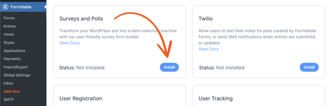
After installing the plugin, navigate to Formidable → Add-Ons to Install and Activate the Survey and Polls Add-On.
Now, you're ready to create your survey! Head to Formidable → Forms → Add New to make your form. Then drag and drop to add fields to ask the questions you want.
You may want to include a Net Promoter Score (NPS) survey, multiple choice questions, Likert scales, and other close-ended research questions to collect quantitative data.
You can also ask open-ended questions, but remember that qualitative data is tougher to analyze.
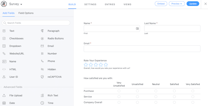
But don't get too carried away — the best way to get a good response rate is to keep your survey short!
Hit Update to save, then publish your survey form on any page or post you choose.
👉 Need help building your survey form? Check out this Knowledge Base article.
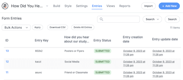
Now, just sit back, relax, and watch the responses roll in! Once you have a couple of entries, you can move on to the next step and interpret the data.
How to analyze survey data
When submissions start, you can analyze basic surveys using Formidable's default reports. Remember — the more survey respondents you get, the more statistically significant data you'll have.
Aren't sure whether you have enough data points? This survey sample size calculator template will tell if your sample is big enough.
So, it's three easy steps:
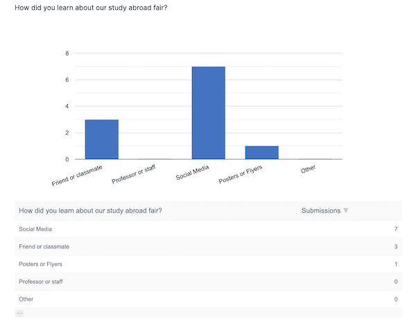
Step 1: View default survey reports
To view your automatically generated survey report, go to Formidable → Forms.
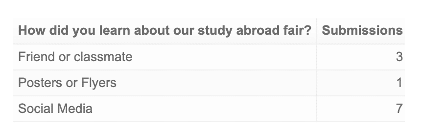
Then select your form and click Settings. You'll see a few graphs presenting your results under the Reports tab at the top of the screen.
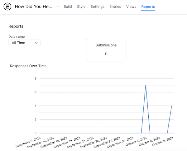
Sure, this graph is pretty basic. But even the simplest data, like the distribution of responses over time, can help you conclude.
It's worth mentioning that these graphs display live data and are updated in real time with every new or edited entry. That way, you always have a clear picture of your survey answers, no matter how many people have responded.
While these default reports can be helpful, they may not give you the in-depth analysis we true data nerds crave. 🤓 We have a few tricks up our sleeve, so keep reading to find out how to create custom charts and graphs.
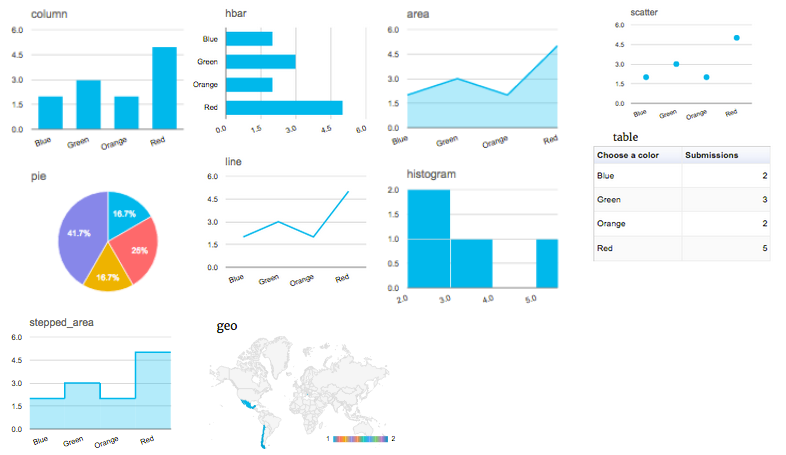
Step 2: Create custom charts and graphs for survey results
Forget formulas, spreadsheets, and coding. All you need to create custom charts and graphs in WordPress is Formidable Forms' handy data visualization feature.
The best part? You can display your data in any page, post, or widget area you choose!
Just install Formidable's Charts Add-On, add the Chart block to your page, pick the form to use as your data source, and you're set!

With a single click, you can switch between different graph styles, including pie charts, bar graphs, and scatter plots.
Step 3: Analyze your entries using statistics
Would you rather display numbers? No problem! You can also use a text-based statistical approach with Formidable. Like with charts and graphs, you must copy and paste shortcodes.
We want to show the average from a star rating survey. So, we'd publish the following shortcode:
[frm-stats id=17 type=average]And ta-da! 🎊 Here's what you'll see on the front end:

It's a simple but effective way to represent any amount of data.
And in Formidable, you can get just as specific with statistical analysis as you can with graphs. Whether you want to display a count, average, total, min/max values, or another result, the shortcodes handle the math.
Check out all the calculation options in our knowledge base article.
Ready to analyze your online survey results?
While we may not be statisticians, we hope this article helped you learn how to analyze data from survey questionnaires in WordPress!
Whether your audience is large or small, analyzing survey answers can be the key to unlocking a new level of success for your online business. Fortunately, getting the most out of your data doesn't have to be difficult.
By using Formidable Forms' built-in reporting and analysis tools, you're sure to get the most out of your web forms and surveys. And let's not forget that this one WordPress plugin lets you collect and interpret survey results.
Now that's what we call an all-in-one survey solution!
And for more data analysis awesomeness, follow us on Facebook, Twitter, and YouTube.
Read more about custom graphs & stats
 How To Create Charts in WordPress (3 Simple Steps)
 How to Calculate a 5 Star Rating Average in WordPress
This article may contain affiliate links. Once in a while, we earn commissions from those links. But we only recommend products we like, with or without commissions.