What a pleasure to have support within minutes. Brillant, accurate answer, and solved the question. Thanks to the Formidable Team. Eric


Last updated on November 1, 2026 by Formidable Team
5 Contact Form Best Practices for High-Converting Forms
Are your contact forms bringing in useless responses, or no responses at all? In this guide, we’ll share five research-backed contact form best practices that move the needle most. Follow them, and your forms turn casual visitors into potential customers.

Approximate read time: 4 minutes
Creating high-converting forms is more than just asking for a name and email address. It's about designing an easy and engaging experience for visitors. And that's what we'll do today.
So, let's dive in and see how to design contact forms to convert.
Upgrade your WordPress site with powerful, flexible forms.
5 contact form best practices to use today
1. Use a well-designed layout
A well-designed layout is essential for making your contact form user-friendly.
Start by arranging the fields in a logical order that aligns with how users share information naturally. For example, start with a name field, an email field, and then a message field. Grouping related fields together makes the form clearer and easier to follow.
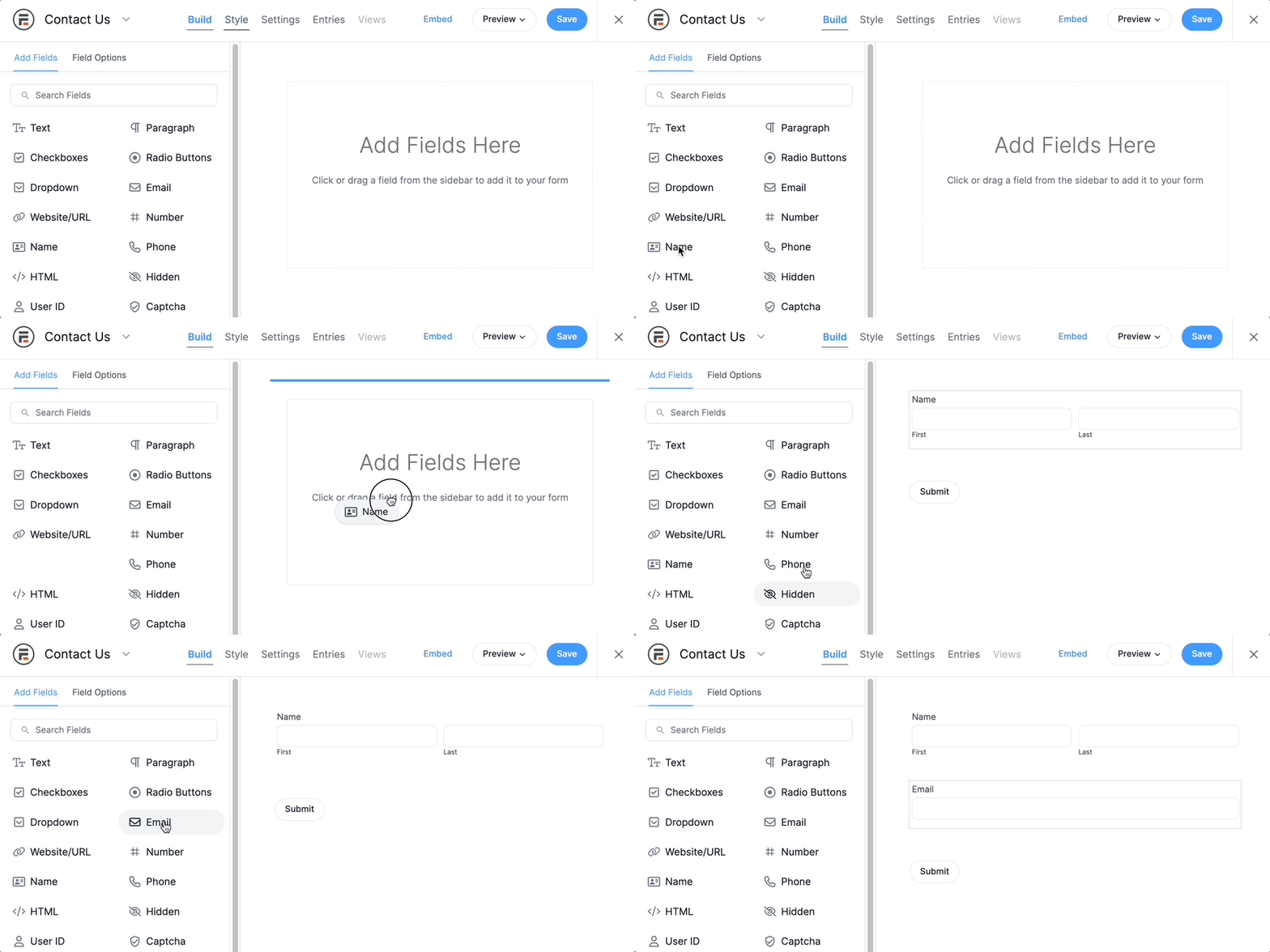
Use headings and sections to break up longer parts of your form into easier parts. Whitespace is your friend, so use it. It prevents the form from feeling cluttered and overwhelming, and it guides the eye naturally from one field to the next.
Remember, the goal is to make the form easy to understand and follow. Contact forms have some of the lowest conversion rates of any form, so the easier it is, the more you can raise that number.
2. Limit the number of form fields
Too many fields can be overwhelming and turn people away.
Reducing the required fields will help create a cleaner form and prevent the user from being overwhelmed. In a study by HubSpot, forms with three fields performed the best (26% conversion), dropping to 22% at five fields and 14% at ten.

Aim for no more than five fields, and set a logical tab order so visitors can move through the form with their keyboard.
You should also consider building a conversational form that guides your users through it one question at a time. This reduces distractions and keeps the form fields to one per page so users don't feel overwhelmed. If a form only has one or two fields, you may consider using it as an inline form.
3. Avoid using puzzle CAPTCHAs
CAPTCHAs are those tests where you must pick images or type words to prove you're not a robot.
While they help block spam, CAPTCHAs can also annoy people. Many people may leave your form if they find it too frustrating. Moz researched the effect of CAPTCHA on completion rates. Over a three-month test period, spam was reduced by 88%, but they saw a failed conversion rate of 7.3%.

There are other ways to stop spam. One option is a honeypot field, a hidden field that only bots can see and fill out. When they do, their submission gets blocked, and real users never notice it because they can’t see it. Another is Cloudflare Turnstile, a free check that usually runs in the background without asking visitors to do anything.
You can also ask simple questions humans can answer, like "What is 2+2?" These options are simple but also add an extra layer of spam protection.
Ultimately, skipping puzzle CAPTCHAs creates a smoother experience that encourages more people to complete your form.
4. Make the errors clear
Everyone makes typing mistakes. When users type answers into your form, it’s an easy opportunity to make one.
But without a clear error notification, you just cause stress on the visitor. If it's too difficult to figure out, they may move on. So, highlight the problem and place a message near the field.
It can be simple, like "Please enter your name" or "Please use a valid email." Regardless, make it clear what the user needs to do so they never have to guess.

Clear and helpful messages improve the user experience and boost the chances you get a submission.
5. Don't ask for personal information you don't need
People typically don't like to give information such as their phone number and address.
This causes high levels of abandonment. KoMarketing shows that a phone number is the leading information users prefer not to include on a form, at 58%, and a home address is next, at 53%.

This is even truer today as spam calls have become more prevalent. If you have questions that only need to be answered based on another field, use conditional logic to build smarter forms.
From Idea to Reality in Minutes. Build Powerful Forms, Dashboards, Apps and More.
Formidable Forms makes advanced site building simple. Launch forms, directories, dashboards, and custom WordPress apps faster than ever before.
Ready to create contact forms that convert?
That's five research-backed ways to increase conversion rates on your contact forms: a clean layout, fewer fields, no puzzle CAPTCHAs, clear error messages, and only asking for what you need. Together, they cover the biggest reasons people abandon a form before submitting it.
If your business depends on visitors using your contact forms, it's crucial that the forms are as optimized as possible. Once yours is live, A/B testing one change at a time, like the button label or field order, is the fastest way to keep improving from there.
Not using Formidable yet? Want to boost your contact form conversions? Check out all the great form builder features to see how Formidable Forms can help you increase your form conversions.

This article may contain affiliate links. Once in a while, we earn commissions from those links. But we only recommend products we like, with or without commissions.