Powerful forms for data collection and Wide API to merge automation using the best wokflows such as N8N, Zapier. Excellent tool for data collection. Recommended 100%. Furthermore, support is awesome.

Last updated on December 4, 2024 by Formidable Team
The Ultimate WordPress Table Plugin for Your Site
Discover the best WordPress table plugin to create responsive, user-friendly tables for your site. Perfect for beginners and pros alike.

Approximate read time: 5.5 minutes
Tables are a great way to organize and show information on a WordPress site.
Whether it's a pricing list, a product catalog, or a custom report, a table is an easy way to show it. And the best WordPress table plugins make it easy. But there are some limits to what you can do. You might only get a few templates or have trouble working with your data.
Formidable Forms is different.
It gives you powerful tools to build tables that fit your needs and save time. You can create tables with data from forms, make them sortable and mobile-friendly, and even let users download them as Excel or CSV files.
Best of all, there's no need to know how to code.
So, in this post, we'll show you why Formidable Forms is the ultimate table plugin for WordPress. You'll learn how it:
- Makes it easy for anyone to collect, display, and share data
- Helps you build responsive, searchable, and sortable tables
- Lets you export data automatically to share with others
Ready to see how it can help you save time and headaches? Let's get started.
Upgrade your WordPress site with powerful, flexible forms.
The problem with generic table plugins for WordPress
Many WordPress table plugins promise to help you build tables quickly. But most fall short when it comes to flexibility and advanced features. This leaves people frustrated, especially if you want more control.
Here are a few common issues with other WordPress table plugins or page builders:
- Limited templates to work with, so there's little variety in how you display your data
- Static data doesn't let you collect new or update data, so you must manually update it
- Advanced features like sorting, filtering, or searching are often missing or difficult to set up
- The tables aren't responsive, so it's a bad experience for mobile users
If you've ever had these issues, you know how frustrating and time-consuming they are to fix.
But Formidable Forms is here to solve those problems (and more!).
From Idea to Reality in Minutes. Build Powerful Forms, Dashboards, Apps and More.
Formidable Forms makes advanced site building simple. Launch forms, directories, dashboards, and custom WordPress apps faster than ever before.
Why is Formidable the ultimate WordPress table plugin?

By itself, Formidable is an online form builder with a database.
It can build any type of form you need using its drag and drop form builder, which saves users tons of time. But when you add Formidable Views for building WordPress applications, a new world of possibilities opens up.
Here's how it works:
- Formidable Forms builds forms and collects data.
- Formidable Views displays the data beautifully on any post or page.
And, unlike other WordPress table plugins, Formidable Forms allows you to build table layouts that match your vision. You can collect data through forms and automatically update your tables, saving you the hassle of manual edits.

Plus, it has features like sorting, filtering, and searching to create dynamic tables. You automatically get a responsive table (like all the forms and views you create!).
Learn more: How to create a searchable database in WordPress
With this (and other features we'll get to below), it's not just about building tables. It's about simplifying your workflow and saving you time.
The best WordPress plugin for collecting table data
Formidable Forms has been the best WordPress form builder for 11+ years.
Why? Because it's easy to use but powerful enough to handle big tasks. And it all starts with the drag and drop form builder:
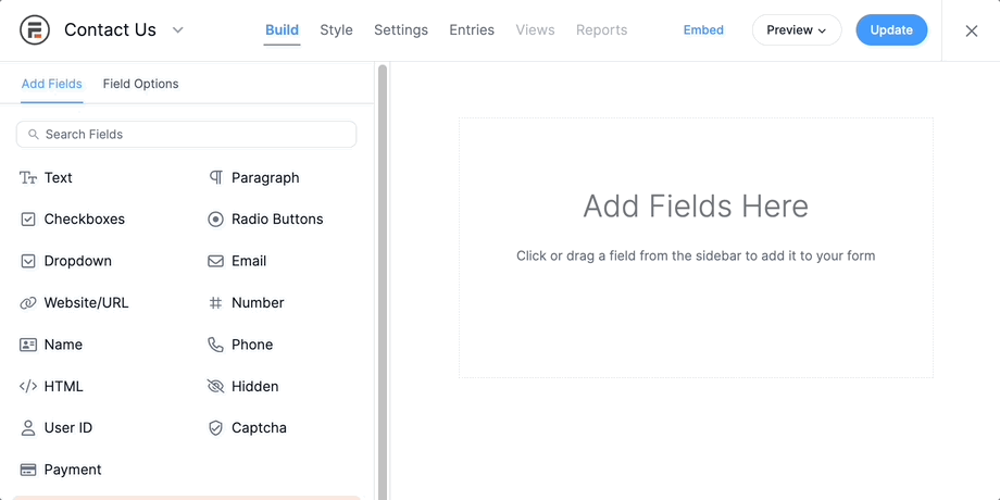
Each field in your form works like a table cell. When someone fills out the form, their data is saved in your WordPress database. You can even publish the form on your website so users can add data for you. And you can show the form (and the View) simply using a Gutenberg block!
Have your data in Google Sheets or Excel? Formidable handles importing/exporting as well. Just save it as a CSV or XML file and upload it to your site. All the data is ready to use in a few minutes.
Once the data is ready, you can turn it into interactive tables with Formidable Views 👇
Create tables and table apps with Formidable Views
With all your data easily accessible, it's time to use it.
The power of Table Views allows you to easily create tables with columns and rows styled however you want them. It's like a bridge between your form entries and how they're displayed on your site.

Need a table that updates automatically with new data?
Connect your form to a View, and check a few boxes. It'll update as new entries come in.
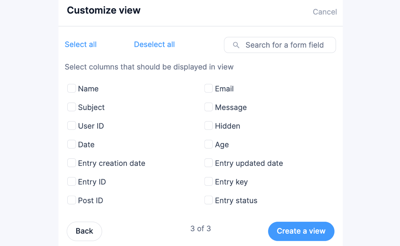
Once a table is created for you, you can rename columns, drag and drop columns, or add new ones. Beyond that, Formidable allows you to customize the content in each row.
You can also choose a Row Style for the Table View. You can now choose between table styling using the WordPress theme, zebra style, or grid style.
Here's an example of the zebra table style:

Then, just insert the table on a page or post and you're good to go.
Get started with the best WordPress table plugin
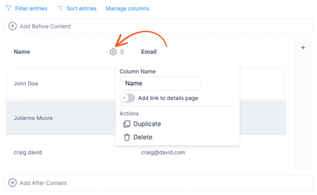
Then, if you still need more control over the table HTML, click to Switch to a Classic View. This gives you full access to all the table HTML instead of just the content. The table app lets you create comparison tables, data tables, league tables, and more with customization options.
Here's an example of a sortable table made with the Classic Formidable WP table builder:

Table Views can help you manage, display, and search data on the front end of your site. Use your data in virtually limitless ways! You can even allow visitors to export the HTML tables to Excel or export the table to a CSV from the front end.
Formidable isn't just another WordPress table plugin. It's a customer service-oriented, all-in-one option. And while the features above are in the Pro Version, you can try it risk-free for 14 days. If you don't love it, we'll return your money!
We hope this post helped you understand how powerful Formidable Forms can be for your site. For more WordPress tips and tricks, follow us on Facebook, Twitter, LinkedIn, and YouTube.
Or, sign up for our newsletter and get it straight to your inbox 📨.
Get the Formidable Forms Newsletter
Read more about Formidable Views
 Forms vs Apps in WordPress: Where Simpler Tools Collapse
 Gravity Forms vs Formidable Forms at Real World Scale
 Formidable Views Just Got a Major Styling Upgrade
This article may contain affiliate links. Once in a while, we earn commissions from those links. But we only recommend products we like, with or without commissions.