After testing many products, I have found Formidable all that I need!

Last updated on July 3, 2025 by Kara Copple
Learn how to create a mobile form with these 5 easy tips. Improve your mobile form design to make it user-friendly and effective!

Approximate read time: 5 minutes
Ever tried filling out a form on your phone and felt like throwing it out the window halfway through?
Yeah, us, too. Mobile forms are tricky. But as more people use cell phones to browse and buy, they're becoming more important. And having a smooth, user-friendly mobile form is even more important.
So that's what this post is for. We'll show you how to create an amazing mobile form. We'll cover everything from the basics to more advanced mobile form design tips to make your forms work and look beautiful.
So, let's get started.
Upgrade your WordPress site with powerful, flexible forms.
Before we dive into the "how," let's talk about the "why."
Making your forms mobile-friendly isn't just about making them look good for aesthetics. Creating mobile forms is crucial for several reasons:
There are a few fantastic reasons to turn all forms into mobile forms. Let's explore the ways you can use proper mobile form design today.
From Idea to Reality in Minutes. Build Powerful Forms, Dashboards, Apps and More.
Formidable Forms makes advanced site building simple. Launch forms, directories, dashboards, and custom WordPress apps faster than ever before.
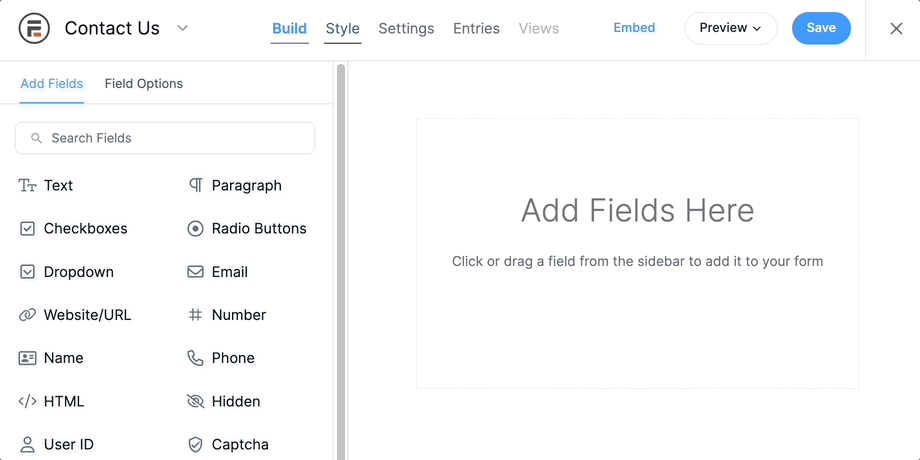
First, if you're using WordPress, we recommend using Formidable Forms for all your forms.
It's the best WordPress form plugin. It automatically creates responsive forms, so all you have to do is create the form and put it on a page or post.
We know there’s no such thing as one size fits all these days. And we never wanted our forms to become difficult to adapt. Whether you build a form from scratch or use one of our templates, our drag and drop form builder makes building web forms simple.
But even if you don't use Formidable Forms, we have some pointers on how to get the most out of your forms.
Take a look at our top tips below:
Simplicity is best. And that's especially true for mobile forms.
Only ask for the information you need. The fewer the fields, the better. It may sound odd when collecting information, but it's better for an overall user experience. Website visitors are much more likely to complete a short, simple form.
That means sticking to required fields only, using conditional logic to show/hide fields, and using clear labels.
For example, a registration form should include the name, email, and other essential information.
This also sticks to a more modern UI design where there's more whitespace and less clutter on the screen.
There are tons of small distractions on a smartphone that lead to form abandonment.
One way to solve this is to split a long form into multiple pages (often called a multi-step form). Ideally, the user can save progress and pick up the rest of the form later. A multi-step form with a progress bar is also useful for long forms. This shows the user how much of the form is left.
That’s only if you need a long form. Honestly, avoid them completely if possible. Keeping a form to one page (or less) is best.
Learn More: Formidable's Multi-Step Form Feature
Buttons are crucial for mobile forms.
They're one of the only ways mobile users can submit information, so making them large and easy to see and click is important.
Generally, you don't want users to zoom in to click a button. A good rule of thumb is 44x44 pixels, Apple's minimum touch size for the iPhone. Also, space them out so they're not too close together, causing accidental submits and button presses.

Contrasting colors help the buttons stand out, making them easy to see. Clear labels and some feedback on tap help users know everything is working. These may seem like small things to adjust, but they make a gigantic difference in how people interact with a form.
And the worst thing you can do is confuse users.
Showing information when someone hovers looks nice and keeps things clean.
But it's a terrible way to show information on mobile devices. Without a mouse, it's almost impossible to see hover content. It does not provide a great user experience, even in the best circumstances.
A better alternative is to have the information on the screen or in a box users can click to expand the content.
But, if it's not necessary, just cut it.
Clear instructions make the difference between a completed form and an abandoned one.
When people know what to expect, they're less likely to make mistakes and abandon the form altogether.
So, here are a few tips to help clear up any confusion:
These are just a few tips to get you started. Continue to experiment and see what works best for the website's audience.
We hope you're feeling confident after reading this post.
These were just the basics of creating a mobile form and improving the experience for website visitors.
Now, it's time to take action. If you have a WordPress website, grab Formidable Forms and create a form! That's all there is to do. It's automatically mobile-friendly, so you can focus on other website tasks.
And you can use the Formidable Forms Lite to do it! But if you want to see what Formidable Forms Pro can do, click below.
Join our community on Facebook, Twitter, and YouTube for more mobile form tips and tricks!
This article may contain affiliate links. Once in a while, we earn commissions from those links. But we only recommend products we like, with or without commissions.


 How To Create a Mobile Survey in WordPress [3 Easy Steps!]
 How to Create a Touchless Kiosk for Mobile Forms
 5 Steps to a Mobile-Friendly Site with a Responsive Contact Form