Powerful forms for data collection and Wide API to merge automation using the best wokflows such as N8N, Zapier. Excellent tool for data collection. Recommended 100%. Furthermore, support is awesome.

Last updated on June 16, 2026 by Formidable Team
How to Make a Responsive, Mobile-Friendly WordPress Form
Want a WordPress form that works as well on a phone as it does on a desktop? With the right form builder, you can build one that scales to any screen, no code required. In this guide, we'll show you how to make a responsive, mobile-friendly WordPress form step by step.

Approximate read time: 7 minutes
Upgrade your WordPress site with powerful, flexible forms.
Why a mobile form is worth getting right
More than half of web traffic is on phones, so for most sites the mobile version of a form is the main version, not the backup. A form that's hard to tap is a form people abandon, and every abandoned form is a lead, a sale, or a signup you paid to attract and then lost at the finish line.
There's a search angle too. Google rewards sites that work well on mobile, which is a real search engine optimization (SEO) advantage, so a form that loads cleanly on a phone helps the page it lives on rank. Get the form right and you improve conversions and visibility at the same time.
From Idea to Reality in Minutes. Build Powerful Forms, Dashboards, Apps and More.
Formidable Forms makes advanced site building simple. Launch forms, directories, dashboards, and custom WordPress apps faster than ever before.
Start with a form that's responsive out of the box
The fastest way to a mobile-friendly form is to not hand-code responsiveness at all. Formidable Forms builds forms that are responsive from the ground up, so the fields scale to fit whatever screen they land on without any extra CSS from you. You build the form once with the drag and drop builder or start from one of the 400+ templates, drop it on a page, and it adapts on its own.
That's the whole point of Formidable's mobile-friendly responsive forms: the layout is handled, so your job is the part that software can't do for you, which is designing the form so it's genuinely pleasant to fill out on a small screen.
If you're not on Formidable yet, the design rules below still apply. You'll just have more manual styling to babysit.

Build a responsive form in WordPress
Here's the short version, start to finish. The form is responsive the moment it exists, so this is mostly about getting it onto the page.
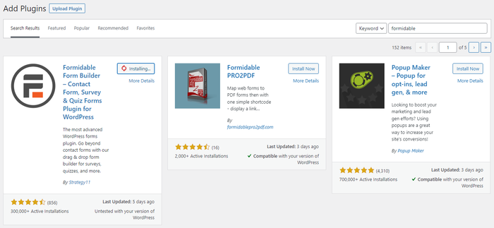
Install and activate Formidable Forms from Plugins → Add New, or start with Formidable Forms Lite from the WordPress.org repository.
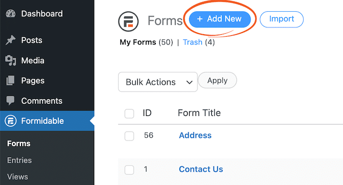
Go to Formidable → Forms → Add New and pick a template or start blank. A contact or booking template gets you most of the way there.
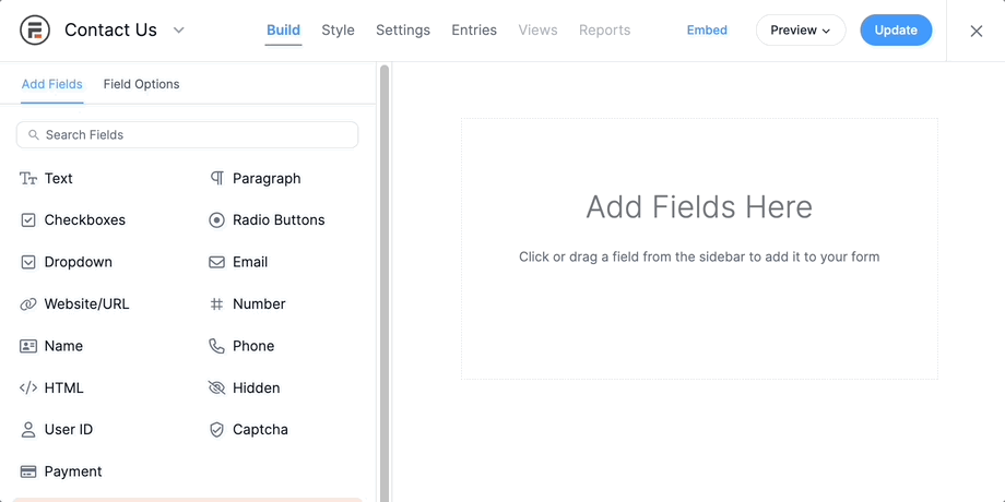
In the drag and drop builder, add only the fields you need. Drag a Dropdown or Date field in where you'd otherwise make someone type, since those are easier to tap.
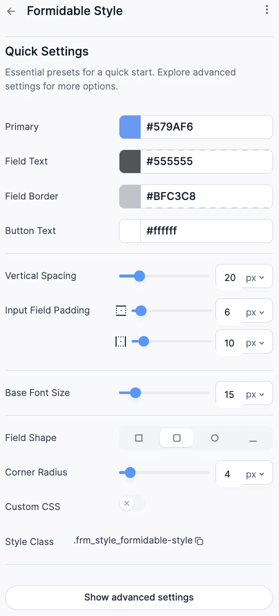
Adjust spacing and styling in the form's style settings if you want, then click Update to save.
Edit the page or post where the form belongs, add the Formidable Forms block, and select your form. Publish.

That's a working, responsive form on a live page. Everything below is how you make it one people actually finish.
Design your form for thumbs, not cursors
A form can be technically responsive and still miserable to use. Responsiveness handles the layout. These rules handle the experience.
Ask for less
Every field you add is another reason to quit, and that's twice as true on a phone. Collect only what you actually need right now. A booking form needs a name, a date, and a way to reach someone, not a mailing address and a "how did you hear about us" essay.
Use conditional logic to keep optional fields hidden until they're relevant, so the form stays short for most people and only grows when it has to. Fewer fields, more whitespace, fewer abandons.
Break long forms into steps
Sometimes you genuinely need a lot of information. When you do, don't stack 20 fields into one endless scroll. Split the form into a multi-step form with a progress bar so people can see how much is left and feel like they're making progress instead of falling down a well.
Better still, let them save and return later. A long form on a phone competes with texts, notifications, and the bus arriving, so anything that lets someone pick up where they left off rescues submissions you'd otherwise lose.
If your form really has to be long, Save and Continue is worth the upgrade. It adds a save button beside submit and emails people a link back to their draft, so a long form on a phone stops being a one-shot deal.

Make buttons big enough to tap
Buttons are how mobile users do everything, so size them for fingers. Apple's guideline of 44 by 44 pixels is a reliable minimum for a comfortable tap target. Space buttons apart so nobody submits twice or hits the wrong one by accident, and give each one a clear label and a bit of visual feedback on tap so people know it registered.
Skip anything that relies on hovering
Hover effects look tidy on a desktop and do nothing on a touchscreen, because there's no cursor to hover with. If you're hiding help text or options behind a hover, mobile users will never see them. Put the information on the screen, or behind a tap-to-expand control. If it isn't essential, cut it.
Write instructions that remove doubt
Clear guidance is the difference between a finished form and an abandoned one. A few things that help on small screens:
- Plain labels. Short and specific. People shouldn't have to guess what a field wants.
- Helper text where it matters. Something like "We'll only use this to send your receipt" tells people why you need it, which is usually all they wanted to know.
- Mobile-friendly inputs. Dropdowns, checkboxes, and date pickers are easier to tap than free-typing on a phone keyboard.
- Useful error messages. "Phone number needs 10 digits" beats a red box with no explanation.
For a grooming business taking bookings, that might mean a single Pick a time for Mr. Whiskers dropdown instead of a free-text field where someone types "whenever, idk." The clearer the form, the fewer the surprises.
Test your form on real screens
Pull up the page on a phone, a tablet, and a desktop, and actually submit a test entry on each. A form can look fine in a screenshot and still be a pain to use if the tap targets are cramped or the keyboard covers the button.
Run through it the way a visitor would. Can you reach every field with your thumb? Does the submit button stay visible when the keyboard opens? Does the confirmation message actually appear? A form that passes that quick gauntlet is one you can trust.
Fix a form that won't scale
If you've tested and something's off, work through the layers in order. The culprit is almost always one of these.
- Check the theme. Forms sit inside your theme's styling, so if the theme isn't responsive, the form can't be either. Load a page with no form on it across devices. If that breaks too, the theme is the problem.
- Check the form itself. With Formidable, forms scale by default, so if one isn't, something inside it has a fixed width that's blocking the rest. A wide table or an image that won't shrink will pin the whole form open. Make those elements responsive and the form resumes scaling.
- Check your page builder. Drop the form's shortcode onto a plain page with no page-builder blocks around it. If it's responsive there but not elsewhere, the builder's wrapper is the issue.
- Inspect with browser dev tools. Right-click the page and choose Inspect to see the CSS on each element. A frequent offender is generous field padding that looks great on a desktop and swallows the text on a phone. Temporarily add
display: noneto a suspect element to confirm it's the bottleneck, then either fix its width or hide it for good. - Retest everywhere. Once you think it's fixed, run the phone, tablet, and desktop pass again. Confidence comes from checking, not hoping.
Wrapping up
A mobile-friendly form comes down to 2 things: start with a form that's responsive by default, then design it so it's easy to finish on a small screen. Keep it short, size your buttons for thumbs, drop anything that needs a hover, and test on real devices before you call it done. Do that, and the visitor filling out your form on a phone gets to the submit button instead of giving up on it.
Get Formidable Forms and build a form that works everywhere your visitors do.
Frequently asked questions
- Are Formidable Forms mobile-friendly by default?
-
Yes. Formidable builds responsive forms automatically, so fields scale to the screen without custom CSS. You can still adjust styling, but the baseline layout works on phones, tablets, and desktops out of the box.
- Why does my contact form look broken on mobile but fine on desktop?
-
Usually one element has a fixed width that stops the form from shrinking, most often a wide table, an oversized image, or padding set for large screens. Browser dev tools will show you which element is holding the layout open.
- How many fields should a mobile form have?
-
As few as you can get away with. Ask only for what you need to act on the submission, and use conditional logic to hide anything optional until it's relevant. Shorter forms convert better, and the gap is widest on phones.
- Do mobile-friendly forms help SEO?
-
Indirectly, yes. Google favors mobile-friendly pages, so a form that loads and works cleanly on a phone supports the ranking of the page it sits on, and better usability means more completed submissions.
This article may contain affiliate links. Once in a while, we earn commissions from those links. But we only recommend products we like, with or without commissions.