
Use Formidable's field options and icons to customize your forms and make form building easier than ever. This article will help you learn about the field options and field icons that can make your work easier.
Upgrade your WordPress site with powerful, flexible forms.
Field icons
Formidable's field action icons allow you to duplicate, delete, and move fields. The default text icons give you control over the default values in your fields.
Field action icons
These icons are found in the upper-right corner of each field on your form builder page and can be used to duplicate, delete, or move fields.
- Move field: Re-order fields within your form.
- More options: Click this icon to show more options.
- Delete: Delete a field.
- Duplicate: Duplicate a field and its options.
- Field settings: Open the field settings on the left sidebar.
Layout field action icons
Fields can be multi-selected using the command, control, and shift keys. These selected field groups can then be merged into rows or deleted in batches.
- Shift key: Select one field and then select another field farther apart, and all of the fields in between will also multi-select.
- Command/Control keys: Individually select multiple fields.


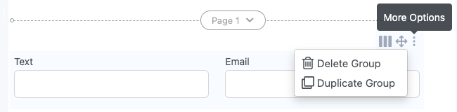
The layout field action icons allow you to select a row or custom layout, multiselect delete, merge and break fields into rows.
- Delete Group: Delete group of fields.
- Duplicate Group: Duplicate a group of fields and its options.
- Multiselect Delete: Bulk deletes selected fields. This option will also appear in the bottom right corner now even if just one group is selected, as long as the group has more than one field in it.
- Merge into row: Merge six or fewer selected fields into a row. Note: This is not available for Page breaks and hidden fields as they don't support layout classes.
- Row layout: Select from the preset row layouts.
- Custom Layout: Create your row layout by entering the number of columns for each field (based on a 12-column grid).
- Layout: Fields can be dragged beside each other, and grid layouts will be automatically applied. Use this icon to assign layouts to a row of fields at once.
- Break into rows: Break the merged fields into a row.


From Idea to Reality in Minutes. Build Powerful Forms, Dashboards, Apps and More.
Formidable Forms makes advanced site building simple. Launch forms, directories, dashboards, and custom WordPress apps faster than ever before.
Free field options
Field Label
Add a name to the field. By default, it will use the field type label. You can change it to any other text or character.
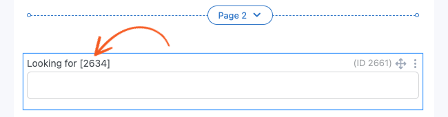
 The field label can be used to display values from other fields. When the value is in the same form, there must be a page break between each field. The value on the field label has to be on a page after the field whose content you want to show. Display the value by inserting the field ID on the field label.
 This value will be included when the [default-message] shortcode is used to send email notifications.
Required
Set a field to required so users must fill in the field before they can submit the form. It applies to all boxes in a field even if the field contains multiple boxes, such as an address field. By default, a required field is indicated with an asterisk (*). This can be changed to any other symbol or text. When the 'Required' box is checked, a new validation message box labeled 'Required' appears. If a user leaves a required field blank, the text in this 'Validation' → 'Required' box will be used to alert users that the field cannot be blank.

CSS layout classes
Add CSS classes to a field. Use your own class or a Formidable layout class to customize your form layout. You can add multiple classes by inserting a space between each class.

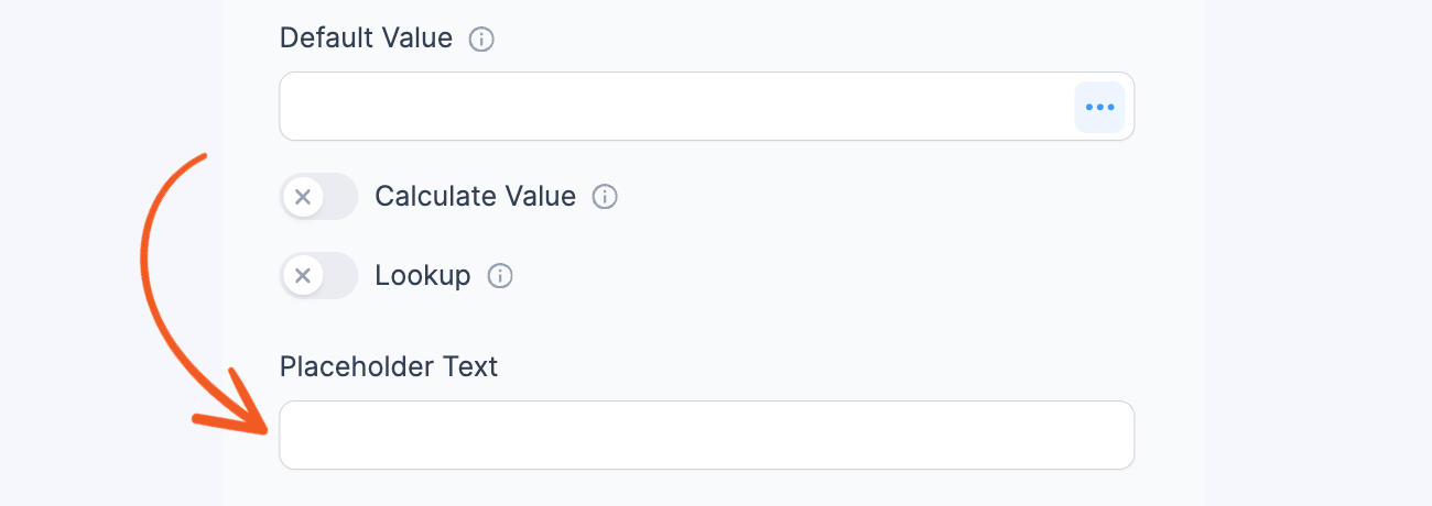
Default Value
Use this option when you would like a field to automatically populate. You can put a default value or shortcode in a field's Default Value box:

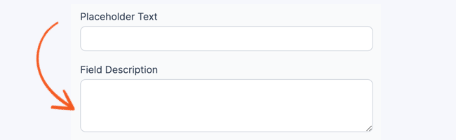
Placeholder text
Use placeholder text to guide users through the process of submitting their information and ensure that every field is filled out correctly. When users start typing in a field, the placeholder texts disappear and will not be included when the form is submitted.
Field Description
A field description can be used to include additional information that explains what is required from the user. By default, it will appear directly below the field input.
Field Size
Set the width of your field and the maximum number of characters that can be entered. In a Dropdown field, you can select 'automatic width', which sets the field size to the width of your longest option. You can change the default field size in your Formidable 'Styles' → 'Field Labels' settings.

Field Type
Displays the current field type and allows you to switch the field to a different field type.

Field Key
A field key can be used to reference a specific field. By default, the key will be a random combination of letters and numbers. You can change the key if you would like, but it must be unique. If it is not unique, Formidable will add a number to the end of it. The key can be used interchangeably with the field ID. Note: a field key may not work correctly if it starts with 'if'.

Label Position
Set the label position of a field to default, top, left, right, inline, none, hidden, or placeholder inside the field. Section headings also include an option to center the heading. The default label position is defined in your Formidable Styles → Field Labels settings.
 The inline option puts the label on the same line as your field as long as the field is not too wide. If you set the label position to none, the label will not be displayed. If you set the label position to hidden, the label will not be displayed, but it will leave a space.
Floating labels
The option Placeholder inside the field uses animated floating labels that is similar to Google's Material Design. It will display the label as placeholder text inside the field until text is entered in the field, and then the label will be moved to Top.

If you'd like to only have a placeholder and not have the label moved above the field when a user types, use these instructions instead.
Pro field options
Unique
Prevents submission of a duplicate field value.
 When you select this option, an error message will appear when the user hits 'Submit' if there has already been a submission with the same field value. You can customize this error message in the 'Validation' → 'Unique' box.
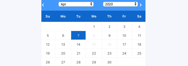
If using a Date field, previously submitted dates will be blacked out so they can't be selected again.
Read Only
Prevents user from editing a field value on the front-end of your site.

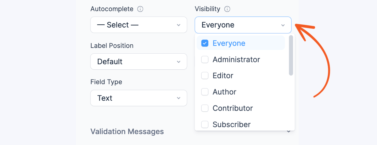
Visibility
Determine who can see a field. If you select a particular user role, all user roles above that option will be able to see the field as well. For example, if you select Contributor, all user types from Administrator to Contributor will be able to see the field. The only exception is logged-out users. If you select this user type, only logged-out users will be able to see the field.
Calculations
You can perform both numerical and text calculations with values entered in your form.
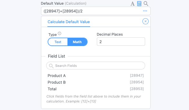 Choose how many decimal places you would like to show. If you choose 0, then there will be no decimals and it will round to the nearest whole number. See Field Calculations for more information about calculations.
Validation
Customize the error messages for each field in this section.

- Required: Customize the error message when a user submits an entry but must still fill out the required field.
- Unique: Customize the error message when a user submits an entry with the same field value.
- Invalid Format: Customize the error message when a user submits an entry with an invalid format.
To customize the default validation messages, go to Formidable → Global Settings → Message Defaults.
Conditional Logic
Conditionally show or hide fields in your form based on values entered in previous fields.
 Use Section Headings to conditionally show or hide large sections of your form. See the Conditional Logic page for more information.
Before & After Input
This setting allows you to prepend/append your fields with a symbol or text. It is especially helpful when dealing with values that you would like formatted as a currency.
This setting can be found on field types with a text field or dropdown.
 When you view your form, your modified field will look something like this:

By default, its styling comes from the Progress Bars & Rootline. You can customize the styling for the Before/After Input settings in Formidable → Styles → Progress Bars & Rootline. You may adjust the styling of BG Color and Text Color.

Prepend unicode icons
In addition to prepending keyboard characters, you can also prepend unicode characters. Here's an example of what you can create by appending unicode characters:
 Follow the steps below if you would like to include a unicode character to a field.
- Find a unicode character chart:
Wikipedia has plenty of unicode character charts. Just make sure to choose a chart that displays the character in base+VS15 (text) format as shown in the image above. Copy the character you want to prepend to a field.
- Go to edit your form.
- Navigate to the field you would like to modify and open the Field Options.
- Paste the unicode character you chose in the Before input setting.
- Preview your form. If the unicode character you chose appears as a box, that character is not compatible with your browser. Best practice would be to select unicode characters that are cross-browser compatible (the simpler the better). If the character you chose appears, but is very small, you may have copied the emoji or base code point version of the character. You will need to go back to step one and make sure you copy the base+VS15 (text) representation of the character.

Field-specific options
Most fields have additional options that can add to the functionality of your form. Click on a field type below to learn about its field-specific options.
