
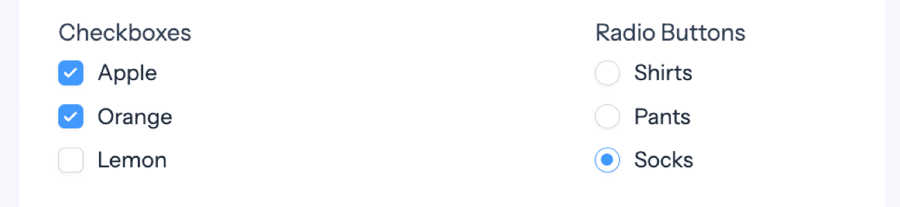
Checkboxes and Radio Buttons are very similar. They both display a list of options which a user can select from. Checkbox fields allow the user to select one or more options and boxes can be checked and unchecked. Radio Buttons fields will allow only one option to be selected. A Radio Button cannot be unchecked.
Upgrade your WordPress site with powerful, flexible forms.
Standard field options
Checkbox and Radio Button fields have the following standard options:


From Idea to Reality in Minutes. Build Powerful Forms, Dashboards, Apps and More.
Formidable Forms makes advanced site building simple. Launch forms, directories, dashboards, and custom WordPress apps faster than ever before.
Field-specific options
In addition to the standard field options, Checkbox and Radio Button fields have several field-specific options. Browse the sections below to learn more about the options specific to Checkbox and Radio Button fields.
Add Option
Click the (+) button to add a new option to your field.
Reorder individual checkbox, radio, or dropdown select options by moving the drag and drop icon
When a duplicate option value is added to the list of options, a popup message is displayed to avoid issues with duplicate option values getting added to a field.
Bulk Edit Options
Checkboxes, dropdowns, and radio buttons have a Bulk Edit option which allows you to add, edit, or remove a lot of options quickly.
You can use this to easily add a large number of choices to your field by typing them into the box that appears when you select Bulk Edit Options. You can also use this option to populate your field choices with a ready-made list of Countries, U.S. States, U.S. State abbreviations, age ranges, levels of satisfaction, importance, or agreement.
To bulk edit options with separate values, put the label, followed by a |, followed by the value. For example:
Excellent|10
Very Good|8
Fine|5
Not so great|3
Poor|1
Add Other
Allow users to enter free text with an 'Other' option. Click the 'Add Other' box to add this option.
Use separate values
Check this box if you would like to store an entry as a value distinct from the selected value. For example, if your user selects black t-shirt, you can store the value as black t-shirt $25.00. Read more about separate values.
Option Layout
By default, the option layout is set to One Column. If you would like all the options on one line, change option layout to Inline Options.
Selection Maximum
Set the maximum number of options the user can select in a checkbox field. Enter a numerical value in the Selection Maximum box to limit the number of options selected at once. This feature is exclusive to checkbox fields. After reaching the limit, any unchecked options left will become unavailable. If you want to choose a different option, you must first deselect one of the currently selected options.
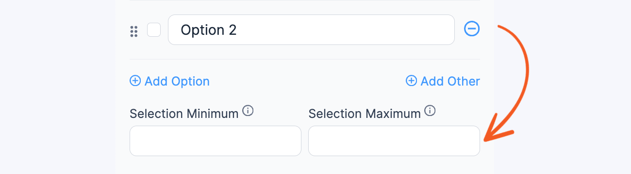
Selection Minimum
Set the minimum number of checkbox options that user is allowed to select in the field. This feature is exclusive to checkbox fields.
Default values and field icons
Set a dynamic default value in your Checkbox or Radio Button field. If you would like to retrieve a value from an entry see the Get a Value From an Entry page. If you would like to set a default value, see the Default Values page.
Field action icons allows you to duplicate, delete, and/or move a field on the form builder page. See field action icons for more information.
Field styling
Some checkbox and radio field-specific styling is available in Formidable → Styles → Check box & Radio Fields. You may adjust the styling of your option labels and adjust the default option alignment.

To learn more about styling your form see the visual form styler page.
Add images to Checkboxes or Radios
Learn how to use radio buttons or checkboxes with images.

See how to replace radio buttons with images in WordPress forms in the blog for an example.
Display options in a grid
If you would like to display your Checkbox or Radio fields in a grid as shown below, see how to create a grid.
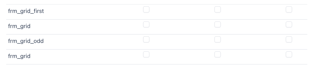 Once you have a grid set up, you may add labels to the grid.
Edit checkbox options
If you would like to modify an individual Checkbox or Radio Button option, see the edit radio/checkbox options section.
Hide option labels
If you would like to hide your Checkbox or Radio Button option labels, see the hide option label section.
Include a link to agree to terms
Do you have an existing terms and conditions page on your site that you would like to link to and require agreement from within your form?
- Add a checkbox field to your form.
- Add a new option that looks like this:
I agree to the <a href="URL_of_your_terms.com" target="_blank">user agreement terms</a>. - In the field settings, mark the field required and set the label position to "none".
- Select the "save separate values" option and change the saved value to something without HTML for best results ie "I agree".


If you would prefer to include the terms within the form, read more about how to create a terms and conditions field.
Display Checkbox and Radio fields
Display the value submitted in a Checkbox or Radio Button field in a form's confirmation message, email, or View.
- Display submitted options: Display the value submitted in a Checkbox or Radio Button field.
[x]
Replace x with the ID or key of the Checkbox or Radio Button field.
- Display saved value: If using separate values and you would like to display the Saved Value use show="value":
[x show="value"]
Replace x with the ID or key of the Checkbox or Radio Button field.
- Separator: Use a different separator for Checkbox field values. By default, this will be a comma.
[x sep=", "]
Replace x with the ID or key of the Checkbox field.
Display unchecked options
To display the unchecked checkbox or radio options in a form's confirmation message, email, or View, you can use conditional statements. The following example will display an option when the checkbox or radio field does NOT contain a specific word or phrase.
[if x not_like="Easy"]Easy[/if x]
[if x not_like="Moderate"]Moderate[/if x]
[if x not_like="Challenging"]Challenging[/if x]
Replace x with the ID or key of the checkbox or radio field. Replace Easy, Moderate, Challenging with the field options. If field x does NOT contain the checkbox or radio option, then the content between the opening and closing If statements will be displayed.
Related customizations
Display text in between options
If you would like to display text in between checkbox or radio options, follow the steps below.
- Go to your Form Settings → Customize HTML tab.
- Find the box for your checkbox button or radio field.
- Look for the [input] shortcode in the HTML code.
- Change [input] until you have separated each option in the field. Then you can add any text you would like between the options.
[input opt=1]
[input opt=2]
[input opt=3]
...

Display values checked in a View
Replace the field ID of your checkbox field in the view you are using with:
<div>
☑-[x sep="</div><div>☑-"]
</div>
Where x is the field ID of your checkbox field.
Display values checked in columns
In the example below, you'll be displaying the values checked in three columns by adding a class and some CSS styling.
In the View Content box, add the following:
<div class="frm-three-columns">[100 sep="<br>"]</div>
Replace 100 with the ID or key of the Checkbox field.
In the Formidable → Global Settings → Custom CSS, add the following:
.frm-three-columns {
  -webkit-columns: 100px 3; /* Chrome, Safari, Opera */
  -moz-columns: 100px 3; /* Firefox */
  columns: 100px 3;
}
Display values checked in a horizontal column
If you want to display the values checked in a three column layout wherein all the values are listed horizontally by default, follow the steps below to add a class and some CSS styling.
In the Listing Page Content box of your View, add the following:
<div class="frm-three-columns"><div>[264 sep="</div><div>"]</div></div>
Replace 264 with the ID or key of the Checkbox field.
In the Formidable → Global Settings → Custom CSS, add the following:
.frm-three-columns {
    width: 100%;
    display: flex;
    flex-wrap: wrap;
}
.frm-three-columns > * {
    width: calc(100% / 3);
}
Display checkbox items in a list
Use the example below to display values checked in a bulleted list.
<ul>
    <li>[100 sep="</li><li>"]</li>
</ul>
To display the values checked in a numbered list, use this instead.
<ol>
    <li>[100 sep="</li><li>"]</li>
</ol>
Replace 100 with the ID or key of the Checkbox field.
Related developer hooks
- Dynamically populate checkbox fields with the frm_setup_new_fields_vars hook.
- Remove used options with the frm_setup_new_fields_vars hook.
- Order field options with the frm_setup_new_fields_vars hook.
- Add user list to checkboxes or radio buttons with the frm_setup_new_fields_vars hook.
- Create a new set of preset Bulk Edit options with the frm_bulk_field_choices hook.
- Require a minimum number of checked values with the frm_validate_field_entry hook.
