
A Number field is used for entering numbers. It only passes validation if the value entered is a number that falls within the designated range and step settings.
Upgrade your WordPress site with powerful, flexible forms.
Standard field options
Select the field in the form builder to see its options in the Field Options tab. Most of them are in the Advanced section, so click Advanced to show them.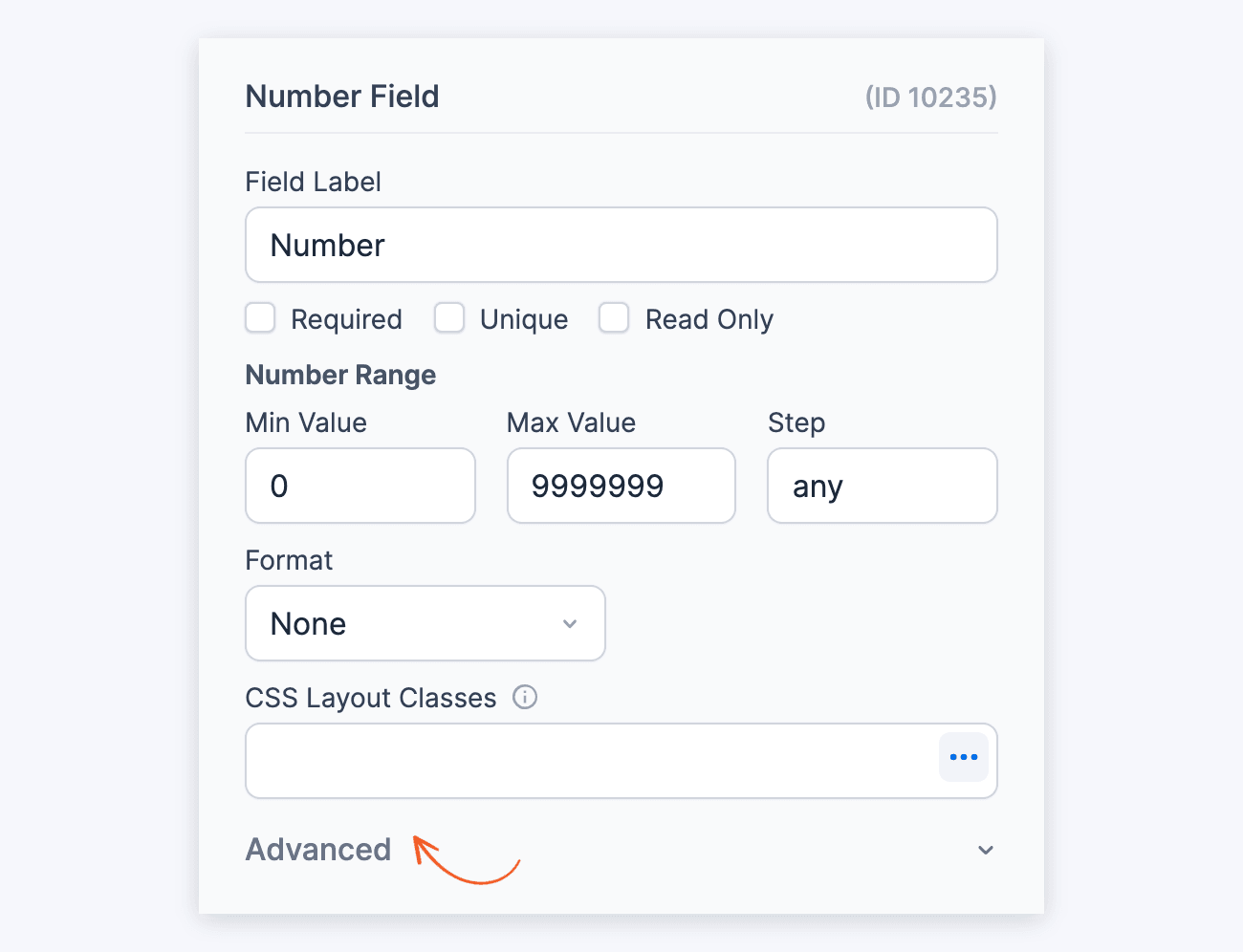
With Advanced open, the panel shows the options below. Validation Messages and Conditional Logic are separate sections under it. Click a section's heading to expand it.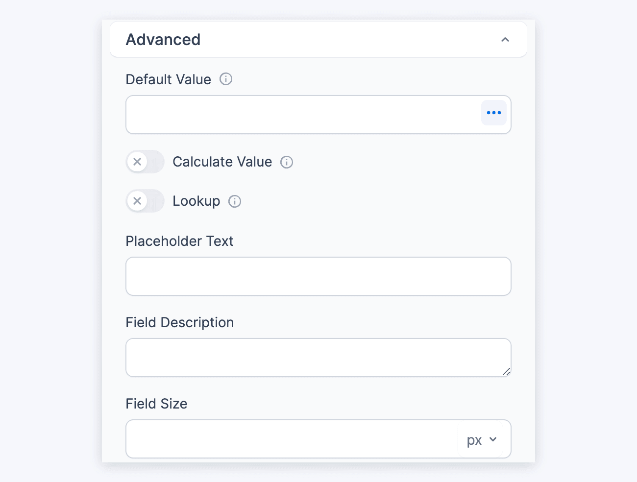
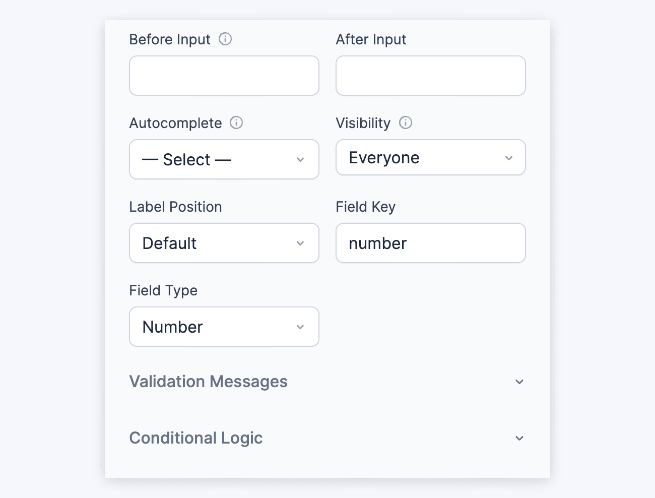
Number fields have the following standard options:
- Field Type
- Required
- Field Key
- CSS Layout Classes
- Label position
- Field Size
- Default Value
- Placeholder Text
- Field Description
- Validation Messages
From Idea to Reality in Minutes. Build Powerful Forms, Dashboards, Apps and More.
Formidable Forms makes advanced site building simple. Launch forms, directories, dashboards, and custom WordPress apps faster than ever before.
Field-specific options
In addition to the standard field options, Number fields have the Number Range, Autocomplete, Invalid Format, and Format options. Read more about these options below.
Number range
This option is for browsers that support the HTML5 number field. In the Min Value and Max Value boxes, enter the lowest and highest numbers the field accepts. They're set to 0 and 9999999 by default.

With the default Min Value of 0, the field doesn't accept negative numbers. To allow them, enter a negative Min Value, such as -1000.
The Step setting controls which numbers are accepted. It's set to any by default, which allows all numbers, including decimals.
- To accept only whole numbers, enter 1 in the Step box.
- To accept up to 2 decimal places, enter .01 in the Step box.
Autocomplete attribute
This field setting allows you to set an autocomplete HTML attribute. The autocomplete attribute asks the browser to attempt autocompletion based on user history. Read more about the autocomplete attribute.
The options give context to autofill features in browsers. To set it, find the Autocomplete dropdown in the field's Advanced section. For a Number field, it lists On, Off and number values, such as Birthday year or Postal Code, but not Birthday. Nothing is selected by default.
Invalid format message
When the value entered isn't in the right format, the field shows its Invalid Format message. Email, Website/URL, Phone, and Number fields start with a message that tells the user what to enter:
- Email: "Enter a valid email address, like name@example.com"
- Website/URL: "Enter a valid web address, like https://example.com"
- Phone: "Enter a valid phone number"
- Number: "Enter a number"
To change it, open the field's Validation Messages section and edit Invalid Format.
In a Number field, users can't type letters. The browser also checks the number and shows its own message before the form is sent. So the Invalid Format message rarely shows for a Number field.
Custom format
To show the number with your own separators and symbols, select Custom in the Format dropdown. The Format dropdown is set to None by default.
Then set the separators in the Thousand and Decimal boxes, and the number of decimal places in Decimals. Add a currency or unit symbol in the Left symbol or Right symbol box.
Currency format
To show the number in the field as currency, select Currency in the Format dropdown. It follows the currency format set in Formidable → Global Settings by default. This format includes 2 decimal places and a currency symbol.
To use a different format, uncheck Use Global Currency Settings. Then set the Thousand and Decimal separators, the Decimals, and the Left symbol or Right symbol.
The currency formatting is applied when the user leaves the field. For example, if a user types 5000, it changes to $5,000.00.
Default values and field icons
Set a dynamic default value in your Number field. To retrieve a value from an entry, see the Get a Value From an Entry page. To set a default value with one of our dynamic shortcodes, see the Default Values page.
Under Advanced, use the Default Value box to prefill the field, or the Placeholder Text box to show hint text inside it. A default value is submitted with the form unless the user changes it. Placeholder text disappears when the user starts typing and is not submitted. The Calculate Value and Lookup toggles sit under the Default Value box. They fill the field with a calculation or with a value from a Lookup field instead. Learn how to set a default value and how to set a placeholder in a text field.
On the form builder page, drag a field by its move icon to change its position. To duplicate or delete a field, click its More Options (⋮) icon. See field action icons for more information.
Display Number fields
Display the value submitted in a Number field in a form's confirmation message, email, or View.
Display value
Display the value submitted in a Number field.
[x]
Replace x with the ID or key of the Number field.
Decimal places
Determine how many decimal places are included in the displayed number.
[x decimal=2]
Replace x with the ID or key of the Number field.
Decimal point
Determine which character is used as the decimal point in the displayed number. By default, this will be a period.
[x dec_point="."]
Replace x with the ID or key of the Number field.
Thousands separator
Determine which character is used as the thousands separator in the displayed number. By default, a Number field shows no thousands separator. With the Currency format, it uses the currency's separator.
[x thousands_sep=","]
Replace x with the ID or key of the Number field.
dec_point and thousands_sep, and use a period for one and a comma for the other. Other characters, such as a space or an apostrophe, give wrong amounts. For example, [x thousands_sep="." dec_point=","] shows $2.345.678,12, with your currency's symbol.Left symbol
When the Number field's Format option is set to Currency, you can specify the currency symbol's position and character. To display a symbol on the left side of the number, use the following shortcode.
[x symbol_left="$"]
Replace x with the ID or key of the Number field.
Right symbol
When the Number field's Format option is set to Currency, you can specify the currency symbol's position and character. To display a symbol on the right side of the number, use the following shortcode. The empty symbol_left="" removes the currency's left symbol, so only the right one shows.
[x symbol_left="" symbol_right="€"]
Replace x with the ID or key of the Number field.
Display number as currency
Format the number using the currency selected in Formidable → Global Settings. By default, this includes two decimal places.
[x format=currency]
Replace x with the ID or key of the Number field.
Display currency as number
When you enable currency formatting, the number is automatically formatted as currency. Use format=number to override this.
[x format=number]
Replace x with the ID or key of the Number field.
Additional customizations
Insert commas as thousand separator
To automatically insert commas as thousand separators while the user types in a number, see this example to add commas to a number.
Add Plus/Minus button
To increase or decrease the numeric value displayed within the input field, see this example to add a plus/minus button.
